Engaging Communities Through Research
Constructing a map of Yolo county health data in partnership with local organizations
During the spring and summer of 2020, as the COVID-19 pandemic had its first waves, I moved back home from the dorms with one quarter remaining of my first year at UC Davis. Although things became very uncertain in the world around me, I had some new projects I was excited to work on. I was hired as a peer advisor in my major (Global Disease Biology), and I began work as a research assistant with the Perinatal Origins of Disparity (POD) Center.
I had introduced myself to the directors of the POD Center in the previous months because of my interest in public health and especially women’s health. My first project was a Public Impact Research Initiative (PIRI) funded project, which was a large data “mapping” initiative to get an idea of child and family health data that were publicly available for Yolo County. The research plan was to learn what data were available about Yolo County residents, and then to look at what gaps remain. Then, our team planned to conduct focus groups with community members and organizations to determine research priorities and potential new programs for the POD Center to conduct within Yolo County. The team consisted of a few other undergraduate research assistants: Kirby Lee, Bianca Puente and Alex Bui, our Master's in Public Health student: Sharon Tafolla, the PI of the PIRI project: Jen Phipps, Ph.D., and the PI of the Health Equity Across the Lifespan (HEAL) Lab, POD Center co-director, and chair of the Department of Human Ecology: Leigh Ann Simmons, Ph.D. MFT.
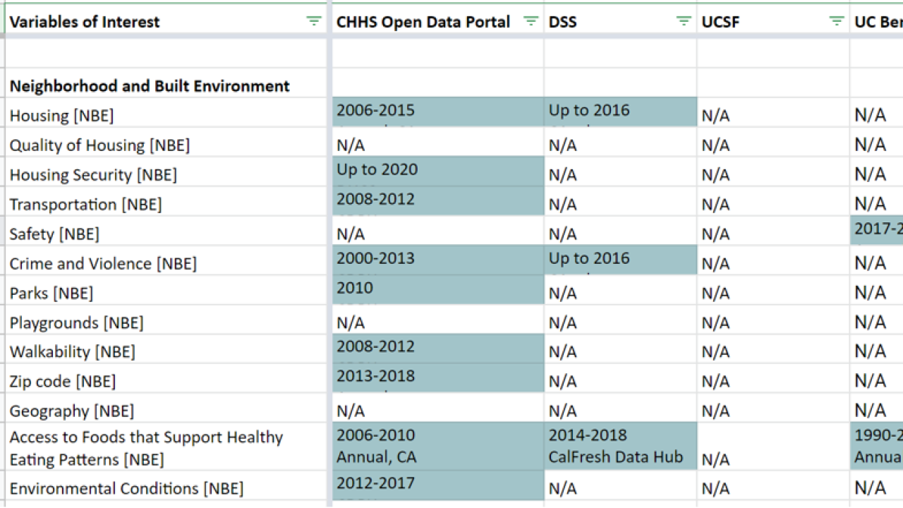
The shift to virtual research began with a large master Google spreadsheet. On the left column was an extensive list of child and family health variables. These included socioeconomic status indicators, education level, access to food and healthcare, substance use, mental health, and perinatal health exposures such as lead and arsenic. Along the top of the spreadsheet were data “sources” such as the Centers for Disease Control, the Department of Education, the Census Bureau, the California Department of Public Health, and the Yolo County Health and Human Services Agency. My job was to sort through the websites of these data sources and keep track of data relevant to any of the variables in the left column. I would find the corresponding box in the spreadsheet and enter key information about the data set: the title, year, scope (local, county, state, national) and a link to the website. Then, I would highlight the box blue. Jen, Sharon, the other research assistants and I would have meetings every few weeks to coordinate who was “mapping” each source of data. Over the summer, I mapped a majority of the data sources, and the spreadsheet began to take shape. We could actually visualize the gaps in data because the spreadsheet was white across those boxes.
It was very interesting for me to see the variables such as substance use, where funding and resources were clearly provided for research and data collection, versus other variables such as “community engagement” where there was little to no relevant data.
We changed course and added new variables as the summer continued into fall. We realized we should keep track of emerging COVID-19 data and its effects on employment, housing, access to food, pregnancy, and breastfeeding. Our team also realized that our data map could contain not only public health data, but also a listing of community-based programs and services by location. This was one of my favorite elements to add because I was able to see the pandemic-specific and non-pandemic services provided by nonprofit organizations and the state of California. We presented our findings from the data mapping to Yolo County community-based organizations, and Sharon worked with them to organize additional focus groups to gain more feedback. The data from the spreadsheet were later used in collaboration with Duke University computer science students as part of a summer “Data+” program to create an online dashboard of Yolo County with services and datasets sorted by location and year. The map is meant to be a resource to community members, researchers, and providers in the region.
I am so glad that I was able to contribute to this project that helped to guide community-based research initiatives within Yolo County. I was able to sharpen my virtual research skills, gain new connections with health equity researchers at UC Davis, learn more about perinatal health data, and engage local organizations as I completed this project.
Learn more about their PIRI Grant Project
All blogs are the personal accounts and opinions of the individual writers and do not necessarily reflect the those of Public Scholarship and Engagement or UC Davis.